Sankey plot
This tutorial shows preset-stage and custom-column Sankey plots. For the full parameter reference, see Sankey Plot.
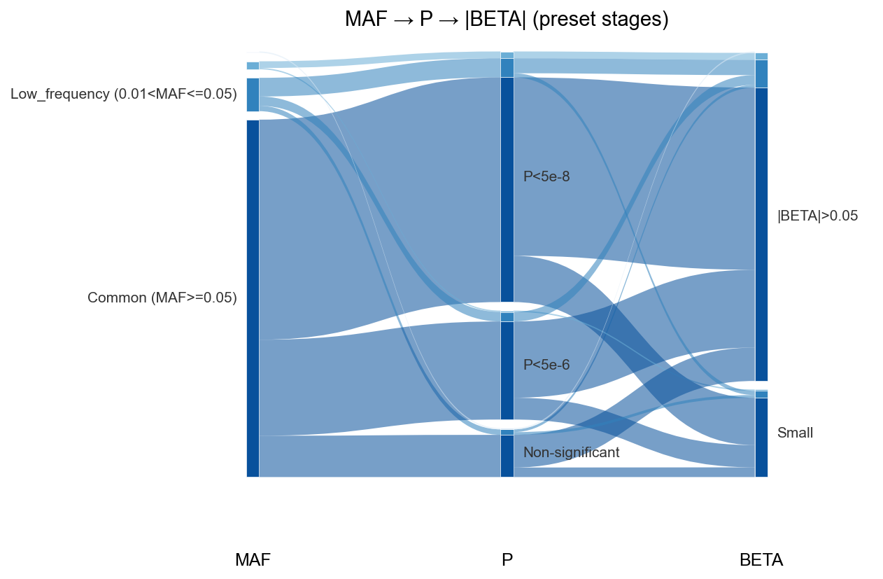
Preset stages: MAF → P → BETA
Preset names MAF, P, and BETA auto-bin from EAF, P, and BETA columns.
Example
rng = np.random.default_rng(0)
n = 300
df = pd.DataFrame(
    {
        "EAF": rng.uniform(0.0005, 0.5, size=n),
        "P": 10 ** (-rng.uniform(4, 12, size=n)),
        "BETA": rng.normal(0, 0.2, size=n),
    }
)

fig, ax, tables = gl.plot_sankey(
    df,
    columns=["MAF", "P", "BETA"],
    title="MAF → P → |BETA| (preset stages)",
    verbose=False,
)
tables["links"].head()
Custom stages: overall vs subtype signal
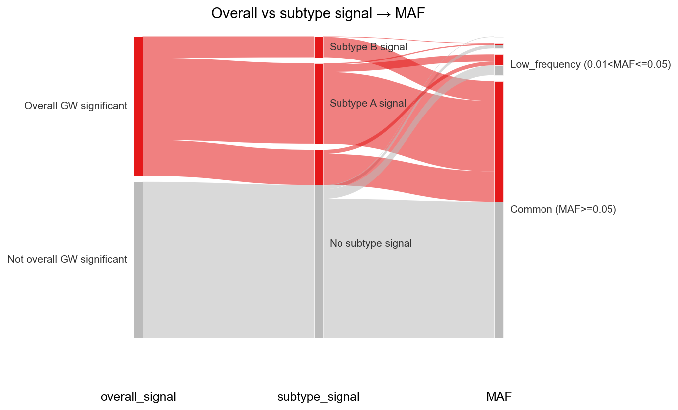
You can pass any categorical columns as stages. The example below simulates overall GWAS significance and subtype-specific signals, then flows into MAF bins.
Example
# Helper: test/fixtures/sankey_demo_data.py
import sys
sys.path.insert(0, "test/fixtures")
from sankey_demo_data import overall_signal_colors, simulate_disease_subtype_sumstats

df = simulate_disease_subtype_sumstats(n_variants=500, seed=0)

fig, ax, tables = gl.plot_sankey(
    df,
    columns=["overall_signal", "subtype_signal", "MAF"],
    colors=overall_signal_colors(),
    title="Overall vs subtype signal → MAF",
    verbose=False,
)
Sumstats method
The same plot works on a loaded Sumstats object (uses .data internally):