Phenogram plot
Available since v4.2.0
stdout:
2026/06/28 15:28:16 GWASLab v4.2.0 https://cloufield.github.io/gwaslab/
2026/06/28 15:28:16 (C) 2022-2026, Yunye He, Kamatani Lab, GPL-3.0 license, gwaslab@gmail.com
2026/06/28 15:28:16 Python version: 3.12.0 | packaged by conda-forge | (main, Oct  3 2023, 08:43:22) [GCC 12.3.0]
Load data
This tutorial uses the bundled T2D GWAS sample file at examples/0_sample_data/t2d_bbj.txt.gz (hg19). Paths below are relative to the repository root after clone; if you run notebooks from the examples/ directory, use 0_sample_data/t2d_bbj.txt.gz instead.
Example
stdout:
2026/06/28 15:28:16 Start to initialize gl.Sumstats from file :examples/0_sample_data/t2d_bbj.txt.gz
2026/06/28 15:28:34  -Reading columns          : P,CHR,REF,SNP,POS,Frq,ALT
2026/06/28 15:28:34  -Renaming columns to      : P,CHR,NEA,SNPID,POS,EAF,EA
2026/06/28 15:28:34  -Current Dataframe shape : 12557761  x  7
2026/06/28 15:28:35  -Genomic coordinates are based on GRCh37/hg19...
2026/06/28 15:28:42 Finished loading data successfully!
Basic phenogram (text mode)
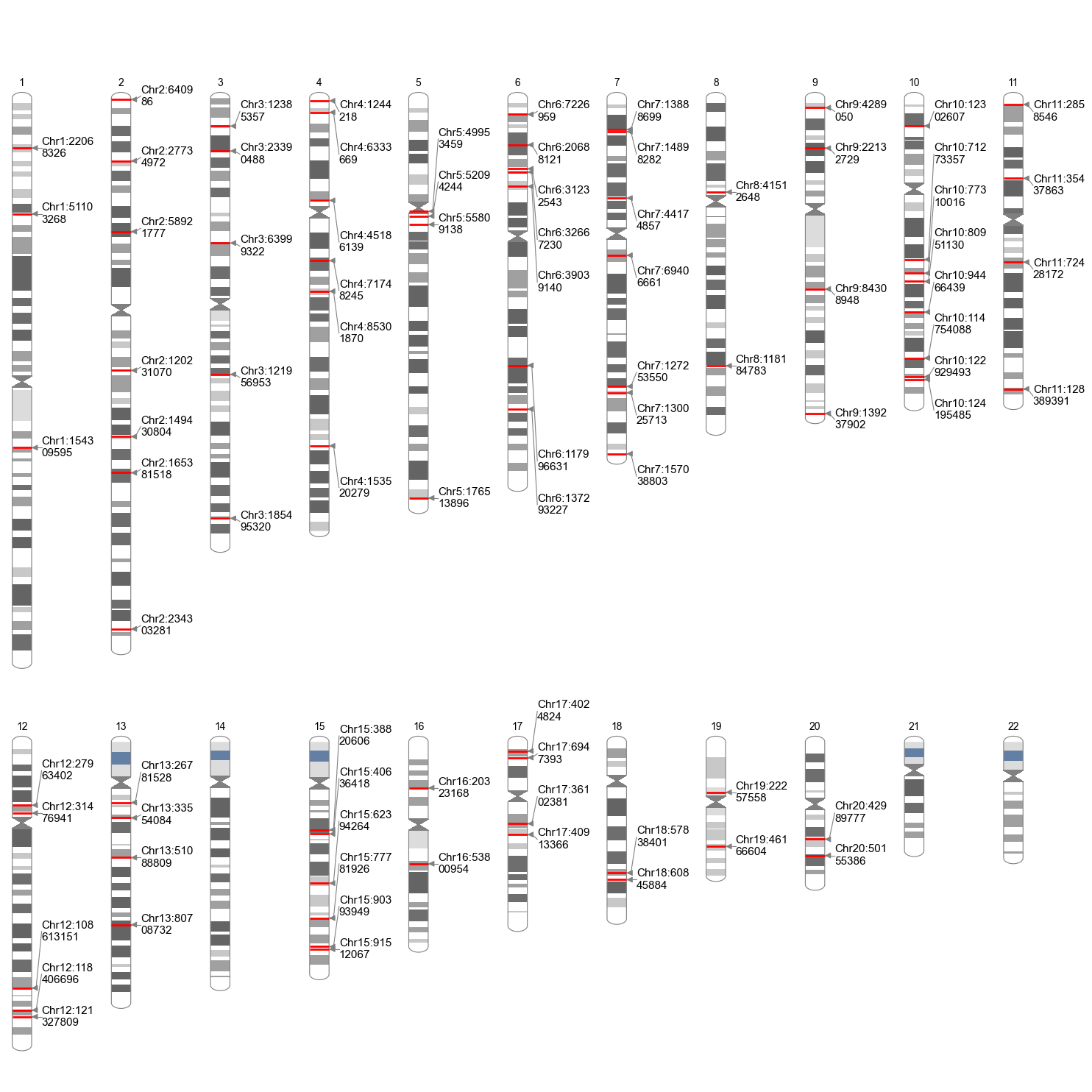
By default, plot_phenogram() extracts lead variants at genome-wide significance (anno_sig_level=5e-8, windowsizekb=500) and draws them on cytoband-colored chromosome ideograms. Set anno=True to label each lead with Chr:POS.
Example
stdout:
2026/06/28 15:28:47 Start to create phenogram plot...
2026/06/28 15:28:48  -Extracting lead variants...
2026/06/28 15:28:50  -Found 9461 significant variants in total...
2026/06/28 15:28:52  -Found 89 lead variant(s) to annotate.
2026/06/28 15:28:52  -Text annotation mode.
2026/06/28 15:28:52  -Label source: Chr:POS
2026/06/28 15:28:52  -Plotting 22 chromosomes...
2026/06/28 15:29:05 Finished creating phenogram plot successfully!
Compact layout
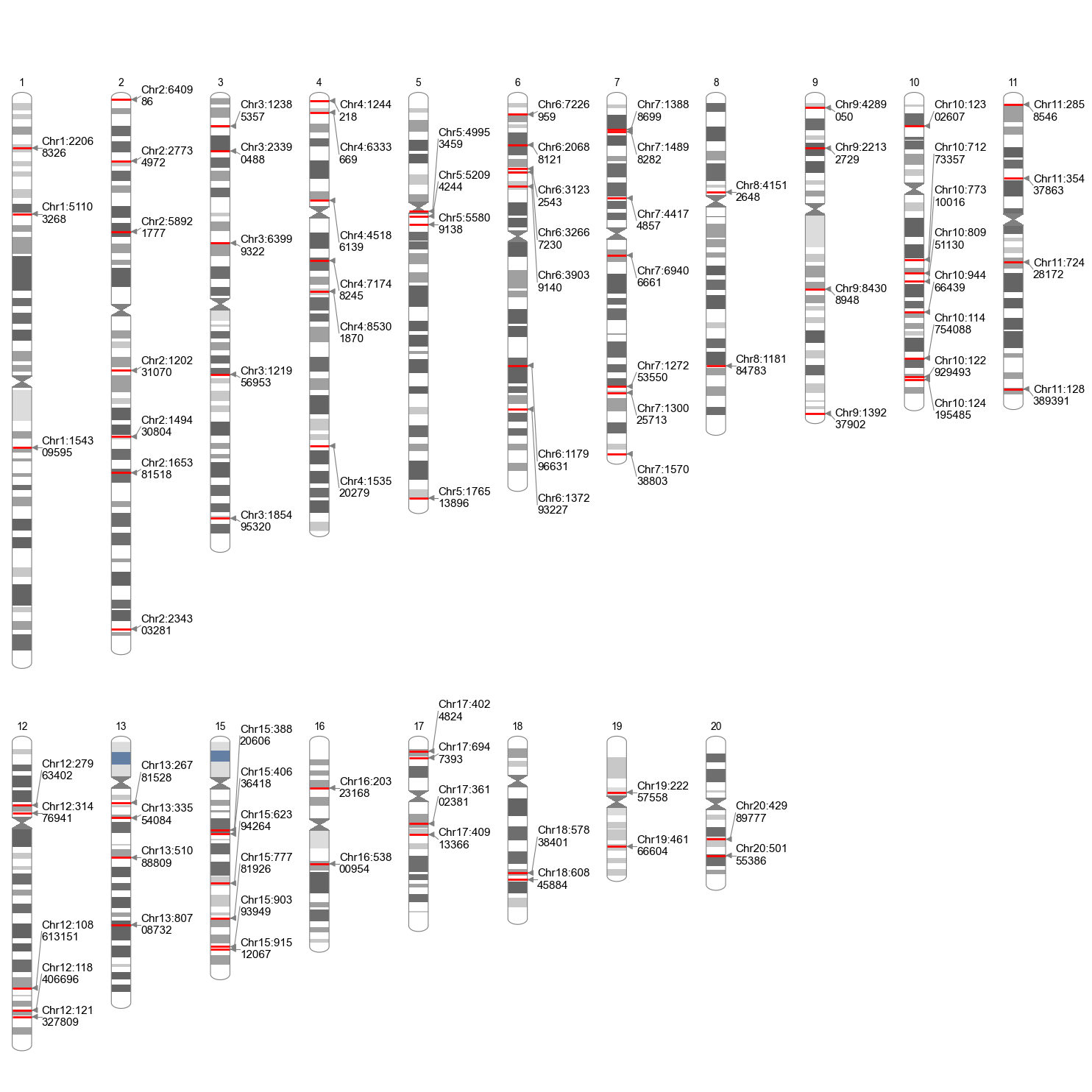
Use only_anno_chr=True to show only chromosomes that contain at least one lead variant. This is useful when you have many hits spread across the genome and want a shorter figure.
Example
Group mode
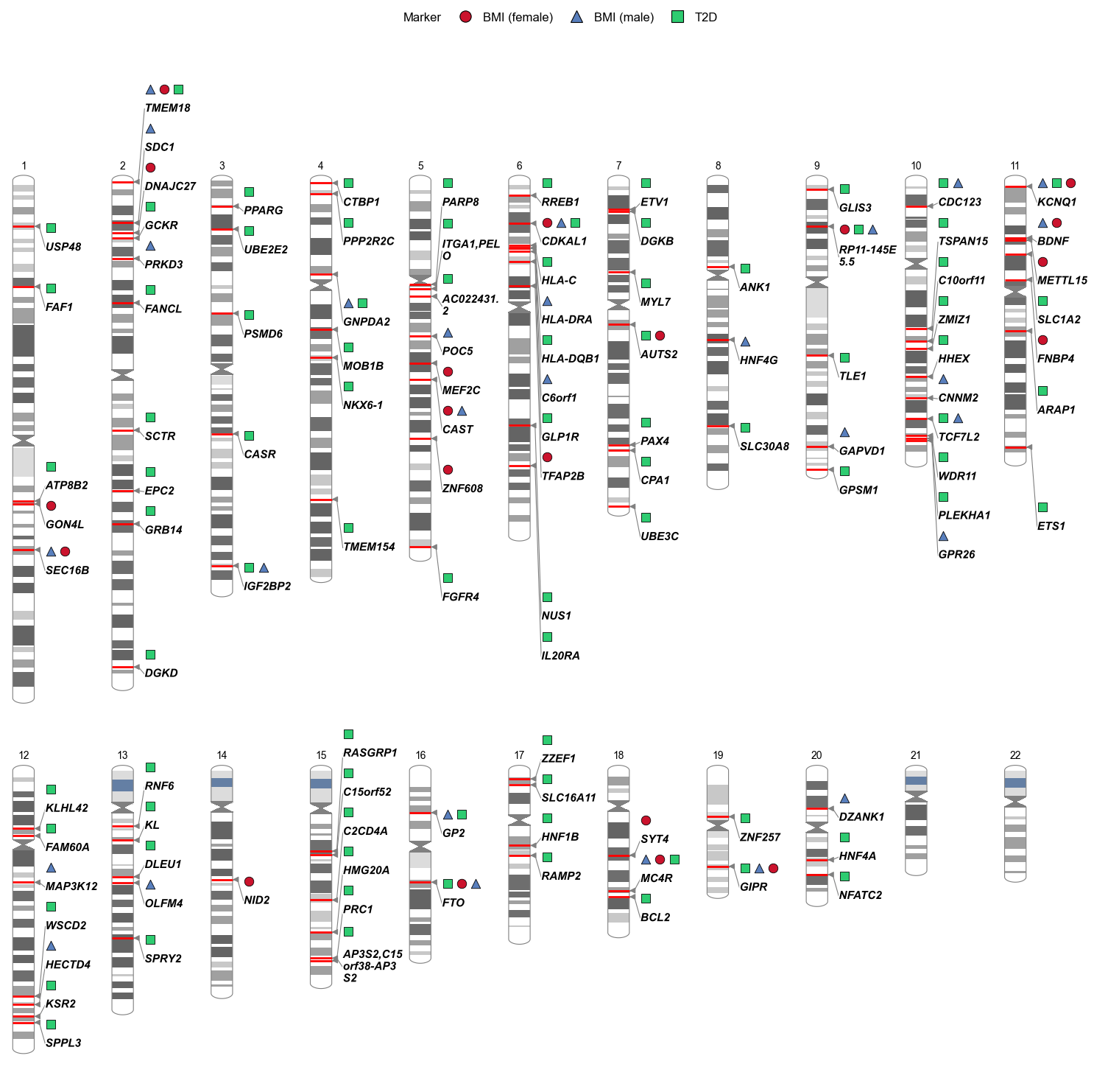
Group mode is enabled when anno_group is set to a categorical column. Each category gets its own marker row with distinct shapes and/or colors, and a figure legend summarizes the groups.
Below we merge genome-wide leads from three BBJ traits—T2D, BMI (male), and BMI (female)—tag each row with TRAIT, assign nearest gene names to a GENE column, then group markers by gene while using trait for shape and color:
Example
# Shared load kwargs (EA/NEA needed for gene annotation)
LOAD_KW = dict(
    snpid="SNP", chrom="CHR", pos="POS",
    ea="ALT", nea="REF", neaf="Frq", p="P",
    build="19", verbose=False,
)

def load_and_leads(path, trait):
    ss = gl.Sumstats(path, **LOAD_KW)
    ss.fix_chr(verbose=False)
    leads = ss.get_lead(verbose=False)
    leads["TRAIT"] = trait  # trait label for marker shape/color
    return leads

# Merge leads from three traits into one table
combined_leads = pd.concat([
    load_and_leads("examples/0_sample_data/t2d_bbj.txt.gz", "T2D"),
    load_and_leads("examples/0_sample_data/bmi_male_bbj.txt.gz", "BMI (male)"),
    load_and_leads("examples/0_sample_data/bmi_female_bbj.txt.gz", "BMI (female)"),
], ignore_index=True)

lead_ss = gl.Sumstats(combined_leads, build="19", verbose=False)

# Add nearest gene name column (required for anno_group="GENE")
lead_ss.data = lead_ss.anno_gene(source="ensembl", verbose=False)

lead_ss.plot_phenogram(
    use_lead_extraction=False,   # input is already a lead table
    anno_group="GENE",           # group markers by nearest gene
    anno_source="ensembl",
    anno_shape="TRAIT",          # marker shape per trait
    anno_color="TRAIT",          # marker color per trait
    marker_shapes=["o", "^", "s"],
    marker_colors=["#CB132D", "#597FBD", "#2ECC71"],
    show_legend=True,
    legend_ncol=3,
    figsize=(12, 20),
    dpi=100,
    verbose=False,
)
stdout:
2026/06/28 15:46:39 Start to create phenogram plot...
2026/06/28 15:46:39  -Using input table directly (no lead extraction)...
2026/06/28 15:46:39  -Found 137 variant row(s) to annotate.
2026/06/28 15:46:39  -Marker mode: 3 shape categories, 3 color categories.
2026/06/28 15:46:39  -Plotting 22 chromosomes...
2026/06/28 15:46:45 Finished creating phenogram plot.
Pleiotropic loci
When several traits share a gene, markers for each trait appear in the same GENE group block; shape and color distinguish which study each lead came from.
Multi-ancestry and multi-subtype (simulated)
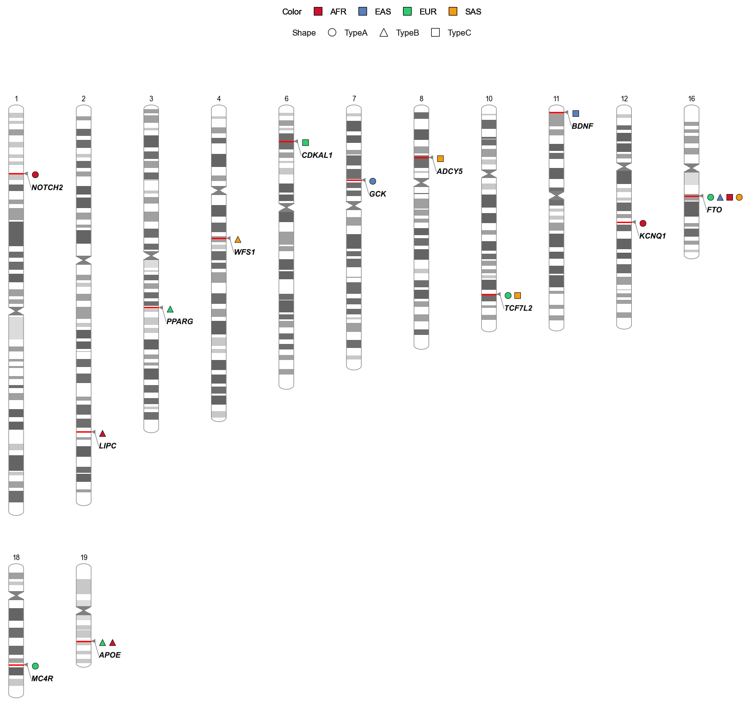
When anno_shape and anno_color point to different columns, the figure shows separate Shape and Color legend rows. Use anno_group to stack variants that share a locus into one marker block.
The example below uses simulated leads: most (SUBTYPE, ANCESTRY) pairs have their own solo locus, while a few hub loci (FTO, TCF7L2, APOE) are shared by multiple pairs—not a full subtype × ancestry grid.
Example
def add_row(rows, rs_i, chrom, pos, locus, subtype, ancestry, p=1e-12):
    """Append one simulated lead; return next rs index."""
    rows.append({
        "SNPID": f"rs{rs_i}",
        "CHR": chrom,
        "POS": int(pos),
        "P": p,
        "LOCUS": locus,
        "SUBTYPE": subtype,
        "ANCESTRY": ancestry,
    })
    return rs_i + 1

rows, rs_i = [], 1

# Shared loci: selected pairs only (partial overlap across ancestries/subtypes)
for subtype, ancestry in [("TypeA", "EUR"), ("TypeB", "EAS"), ("TypeC", "AFR"), ("TypeA", "SAS")]:
    rs_i = add_row(rows, rs_i, 16, 53_800_000 + rs_i * 1_000, "FTO", subtype, ancestry)

for subtype, ancestry in [("TypeA", "EUR"), ("TypeC", "SAS")]:
    rs_i = add_row(rows, rs_i, 10, 114_700_000 + rs_i * 1_000, "TCF7L2", subtype, ancestry)

for ancestry in ["EUR", "AFR"]:
    rs_i = add_row(rows, rs_i, 19, 45_410_000 + rs_i * 1_000, "APOE", "TypeB", ancestry)

# Pair-specific solo loci (unique to one subtype + ancestry combination)
solo = [
    (7, 44_000_000, "GCK", "TypeA", "EAS"),
    (3, 123_000_000, "PPARG", "TypeB", "EUR"),
    (18, 60_000_000, "MC4R", "TypeA", "EUR"),
    (11, 2_000_000, "BDNF", "TypeC", "EAS"),
    (2, 200_000_000, "LIPC", "TypeB", "AFR"),
    (6, 20_000_000, "CDKAL1", "TypeC", "EUR"),
    (12, 70_000_000, "KCNQ1", "TypeA", "AFR"),
    (4, 80_000_000, "WFS1", "TypeB", "SAS"),
    (8, 30_000_000, "ADCY5", "TypeC", "SAS"),
    (1, 40_000_000, "NOTCH2", "TypeA", "AFR"),
]
for chrom, pos, locus, subtype, ancestry in solo:
    rs_i = add_row(rows, rs_i, chrom, pos, locus, subtype, ancestry)

sim_leads = pd.DataFrame(rows)
sim_ss = gl.Sumstats(sim_leads, build="19", verbose=False)

sim_ss.plot_phenogram(
    use_lead_extraction=False,   # input is already a lead table
    anno_group="LOCUS",          # stack shared loci into one marker block
    anno_shape="SUBTYPE",        # shape encodes disease subtype
    anno_color="ANCESTRY",       # color encodes ancestry
    marker_shapes=["o", "^", "s"],
    marker_colors=["#CB132D", "#597FBD", "#2ECC71", "#F39C12"],
    show_legend=True,
    legend_ncol=4,
    only_anno_chr=True,          # omit chromosomes with no leads
    figsize=(12, 16),
    dpi=100,
    verbose=False,
)
stdout:
2026/06/28 15:51:17 Start to create phenogram plot...
2026/06/28 15:51:17  -Using input table directly (no lead extraction)...
2026/06/28 15:51:17  -Found 18 variant row(s) to annotate.
2026/06/28 15:51:17  -Marker mode: 3 shape categories, 4 color categories.
2026/06/28 15:51:17  -only_anno_chr: plotting 13 chromosome(s) with annotations.
2026/06/28 15:51:17  -Plotting 13 chromosomes...
2026/06/28 15:51:18 Finished creating phenogram plot.
See the parameter reference here.